Ads 468x60px

Saturday, November 10, 2012

Highlight Quarters, Weekends in pivot reports using styles [quick tip]

Highlight Quarters, Weekends in pivot reports using styles [quick tip]:
Here is a quick pivot table tip.
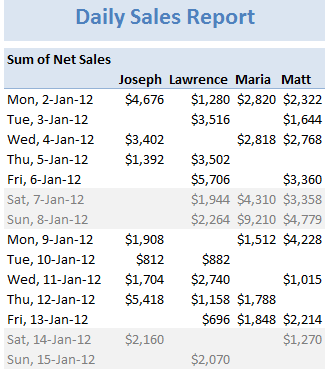
When reporting summaries by month, it would be better to highlight 3 months at a time (Jan, Feb, Mar in one color, Apr, May, Jun in another color) than showing all in one color. Today, lets learn how to do this in easiest possible way.

Monthly pivot report with quarterly shading - Excel Pivot table tip

Highlight Quarters (3 months at a time) using Pivot Table Styles

Edit styles - Pivot table formatting - setting row stripe sizesWe can use pivot table styles for this. Just follow below steps:
  1. Select the pivot table which you want to format
  2. Go to Design tab & select a pivot table style you want.
  3. Right click on the style and choose Duplicate
  4. Select “First Row Stripe” from modify screen. Enter stripe size as 3.
  5. Repeat this step for Second row stripe too.
  6. Click ok.
  7. IMPORTANT 1: Apply this new style to your pivot report.
  8. IMPORTANT 2: Check the banded rows option from Design tab.
Using this technique, you can also highlight weekends in a different color with first row stripe size = 5 and second = 2. See a demo here.
More on this tip: Customize banded rows / columns in tables
Note: This approach works only when your months start on Jan (or other quarter starts like April, July or October) and days start on Monday. Most business data is like that anyway.

Bonus tip: Generate monthly report from daily data

You can use group dates feature in Pivot reports to generate monthly (or quarterly, yearly) reports from daily data. Learn how to do this.

Do you use Pivot table styles?

Formatting a pivot report is often painful. That is where styles can help us. Once you define the correct styles, your pivot reports will look professional and neat. So go ahead and try them. Share your feedback, tips using comments.

More on Pivot Tables

Along with formulas, Pivot tables are best friends of Excel analysts. They can take massive amounts of data, process and summarize in just a few clicks. To learn more about them, use below resources.

Tuesday, November 6, 2012

Show monthly values & % changes in one pivot table

Show monthly values & % changes in one pivot table:
Pivot tables are great help when analyzing lots of data. One of the common questions managers & analysts ask (when looking at monthly sales data for example) is,
How is the monthly performance of our teams (or regions, products etc.)?
A pivot report can answer this question in a snap.
A typical Monthly sales report using pivot tables - this gives incomplete analysis
But the answer is incomplete!
Why? Because, we don’t want sum of sales by month & sales person alone. We want to know their performance! Something like below:


Show monthly values & % changes in one pivot report - Excel Pivot Table examples

Performance eh?!? How to measure it?

There are many ways to measure performance. For our monthly sales data, we can measure performance by comparing,
  • Sales with targets
  • This month value with previous month value
  • This month value with same month last year value
  • One person’s sale with rest of team etc.
One of the most common ways to measure performance in situations like this is to see how this months value has changed compared to previous month.

How to show monthly values &  % changes in pivot?

Do you know that with just a few clicks, we can add % changes to our pivot? Follow these steps:
1. Create a pivot report with months & sales persons (or months & products, months & regions etc.)
2. Add Net sales (or any other metric) to value field area of pivot report
3. Now, add net sales once again to value field area
That is right. You can add same metric more than once to pivot table value field area.
At this point, our report looks like this:
Add same metric two times to the pivot report - this is how it looks after we are done
Showing monthly differences in pivot report using value field settings4. Right click on 2nd value and choose value field settings.
5. Click on Show values as tab and follow below steps. (see image aside)
  1. Choose “% Difference from” from the drop down
  2. Select Month as base field
  3. Select (previous) as base item
  4. Click ok
This will show % changes with respect to previous month in the pivot report!
Showing monthly values & % difference in one pivot report - end result


Extending this to make it even more awesome

1. Clean up the titles

Change the titles to Sales & % change. To do this, just select the first column title and type over. Repeat for 2nd column.

2. Add conditional formatting

Select any cell in the % change column. Go to Home > Conditional Formatting > New rule
[Resource: Introduction to Excel Conditional Formatting, more]
Specify the rule as mentioned in below illustration.
Conditional formatting monthly sales pivot report - instructions

3. Show just icons

We can go one more step and show just icons. Since pivot tables show tool tips on hover, we can easily find % change for any month / sales person by just pointing on that cell.
Pivot table tool tip demo

Finalized monthly report

Our final report looks like this:
Show monthly values & % changes in one pivot report - Excel Pivot Table examples

Download Example Pivot Report

Click here to download this example pivot report. Examine various settings & conditional formats to learn this better.

How do you use value field calculations in Pivot reports?

Although most of my pivots use simple sum or count type of summaries, often I use custom calculations like % difference from, running total , % of row etc. to understand the data better. These are very simple to setup yet give powerful insights.
What about you? Do you use value field settings to modify your pivot reports? What other summary techniques you use? Please share your tips, ideas using comments.

More on Pivot Tables

Along with formulas, Pivot tables are best friends of Excel analysts. They can take massive amounts of data, process and summarize in just a few clicks. To learn more about them, use below resources.

Saturday, November 3, 2012

Write a formula to check if two dates are in same month? [homework]

Write a formula to check if two dates are in same month? [homework]:
Its Home work time folks. Sharpen your Excel pencils and get cracking.

Write a formula to check if two dates are same month? [homework]

Find out if 2 dates are in same month

Lets say you have 2 dates in A1, A2.
Q1. What formula tells us if both of them are in same month?
Both dates must be in same month & year!
Go ahead and post your answer in comments.

You think that was easy, try this then:

The above formula would be very easy for seasoned Excel pros. So I have 2 additional questions:
Q2. How to find out if n dates (A1:An) are in same month?
Q3. How to find if n dates (A1:An) are in a given date range – start date in B1, end date in B2?

Post your answers in comments

Go ahead and post your answers in comments. I am eager to see what creative, fun & awesome solutions you can come up with for this problem.
Click here to post your answer.
PS: Click here for more Excel home works, quizzes & challenges.

Clue: Click here for a clue. Got it?

Wednesday, October 31, 2012

Journey of Hurricane Sandy – Animated Excel Chart

Journey of Hurricane Sandy – Animated Excel Chart:
Hurricane Sandy has taken front seat in all major news channels, papers, websites even in far off places like India. I hope & pray that our readers in US East coast are safe.
Today, lets understand the journey of Hurricane Sandy in this animated chart, prepared by Chris from Excel365.net.

Hurricane Sandy Journey – Animated Excel Chart

Journey of Hurricane Sandy - Animated Chart in Excel

How is this animated chart made?

The basic ingredients of this chart are:
  • An outline map of Americas
  • Data of the storm since it was tropical depression (22nd October) to the time it crossed the coast (30th October)
    • Lat & Long of the storm
    • Wind speeds
    • Pressure
  • A scroll bar form control that shows only a subset of this data
  • A VBA macro that animates the chart
Since all these techniques are previously discussed on Chandoo.org, I am going to list down the process in high-level with links to learn more.
  1. Set up a scroll bar form control
  2. Based on scroll bar position extract first n values only in to another table. Learn more: OFFSET formula *
  3. Use an outline map & bubble chart to plot circles along storm’s trajectory. Learn more: Olympic medals by country since 1900
  4. Change scroll bar values from 1 to ‘n’ using a vba macro, when triggered. Learn more: Creating a clock in Excel
  5. You are done!
* Chris uses #N/A based technique instead of OFFSET ranges in the chart.

Download this and play with it

Click here to download the workbook & learn by breaking it apart. Examine macros & charts closely and add new techniques to your toolbox.

Do you love this? Say thanks to Chris

I really loved this idea. Very intuitive and timely. Thank you so much Chris for sharing this and teaching us something new.
If you loved this, say thanks to Chris. Check out his website (it is in Chinese) for some useful tricks.

Why am I killing Vitamin XL?

Why am I killing Vitamin XL?:
People who were right a lot of the time were people who often changed their minds.

-Jeff Bezos, Founder, Amazon.com #
About 10 days ago, I have introduced Vitamin XL and asked for your feedback. I got several enthusiastic responses (both for and against it).
I have decided to go ahead and kill this product idea. Please read to understand why.
Why I am killing Vitamin XL product idea

What is Vitamin XL & Why I thought of it?

Vitamin XL is a membership program that offers Excel training, resources & community access for monthly fee.
During last 1 year, many of existing customers & supporters of Chandoo.org have told me that I should have a membership program where people can access all our training programs, Excel resources & get help for a monthly fee.
A good business person must prioritize the ideas and work on most promising ones first. Since I have few product ideas in mind, I wanted to make sure that Vitamin XL is worth investing my time. As a first step to this, I conceptualized Vitamin XL and shared the idea with all of you on 19th October for your feedback.

How was the feedback?

With in 1 day of announcing Vitamin XL, it was clear to me that not many of you are excited about it. Although there were many who wanted Vitamin XL and could not wait to join, the negative feedback was overwhelming. Some of the concerns raised are,
  • There is no value in it. Already Chandoo.org offers everything for free.
  • It is too pricey. $30 or $50 per month is just not feasible.
  • It would divide our community in to 2 parts – members & non-members.
  • The offering is not clear. Can I still access all the features (forums, downloads, articles) of Chandoo.org?

My next options were…

Based on this feedback, I narrowed down to 2 options for future of Vitamin XL.
  1. Rework on Vitamin XL’s features & Reduce the price to $99 per year (or $10 per month).
  2. Kill it and work on something else.
At first glance, #1 seemed to be a natural choice. This is because I got several emails (and comments) telling me that Vitamin XL would work at lower price point.

So why I am killing it?

What is true loss?
There is no truer loss than nobody telling you when you are making a mistake.
I don’t know where I read this quote, but it came to my mind when deciding the future of Vitamin XL.
As many long time readers of Chandoo.org know, I run a poll / survey whenever I start work on a new product. Excel School, VBA Classes, Financial Modeling Classes, various crash courses are all born like that. And I do know that for any product, there will be some people who will not like it. So I take the negative feedback with a pinch of salt.
But in case of Vitamin XL, I got lot of personal emails, passionate comments telling me it is not a good idea.
The decision became obvious. Its time I let go of Vitamin XL and worked on something else.

What next?

There is no change whatsoever to Chandoo.org or all our awesome stuff.
  • I will continue to write every week and share something beautiful, fun & useful with you, so that you can become awesome at your work.
  • I will continue to post excellent examples, downloads & videos every now and then so that you can do more & become a hero.
  • I will offer new courses, products & books so that you can learn even more and become a ninja.
During next 2-3 months, I will be working on few more new product ideas:
  1. Advanced Excel School course (slated for launch in Jan 2013)
  2. An iPhone app to learn Excel
  3. Conceptualize & Design an MS Access course
  4. Upgrade our PM Templates to Excel 2010, 2013
  5. Ready to use Excel Dashboard Templates
  6. One / two more e-books
As always, I will take your suggestions & feedback about these ideas.
Meanwhile, you can continue to enjoy our courses & products:

Thank you & Sorry

I feel so fortunate & humbled to know how much you care about Chandoo.org & our future. Thank you.
My apologies for anyone who felt excited about Vitamin XL and wanted to be part of it. I am sorry I am unable to offer it at this time. I am thankful for your kindness & encouragement. It keeps Chandoo.org going.

Friday, October 26, 2012

Designing a Project Portfolio Dashboard [Part 1 of 2]

Designing a Project Portfolio Dashboard [Part 1 of 2]:
In this 2 part tutorial, we will learn how to design a project portfolio dashboard. Part 1 will focus on user needs & design. Part 2 on Excel implementation.

Background: Project Portfolio Dashboards

As you may know, we sell a set of Excel Project Management templates. These templates help plan, track, manage & report a project right from Excel.
While these templates good, they have one limitation. They work for one project at a time. Many customers have asked me if I come up with a project portfolio dashboard that can tell what is going on in a set of projects in one view.
And that is where we begin.

Who uses a Project Portfolio Dashboard?

Program managers, group project managers, IT directors, Project owners & CXOs are the target audience for a project portfolio dashboard. These are the people that oversee multiple projects and want to know what is going on with each of them a high level.
To keep our design task reasonable, we can also say that,
  • Project portfolio consists of at least 5 projects.
  • The dashboard is updated once a month or so.

What should Project Portfolio Dashboard communicate?

When it comes to a portfolio of projects, the users will not be interested in minute details of each project. Rather, they want to know what is going on, where the attention should be focused, how the plan vs. actual performance is, how money is spent etc. In other words, high level details followed up option to drill down.
As per my experience, our dashboard should communicate:
  1. Program overview
    1. Total projects, budgets, teams
    2. Program health indicators – Progress, budget vs. actual, time to complete, un-addressed risks
  2. A summary of all projects
    1. Project progress %s, budget vs. actual spend
    2. Team sizes, outstanding issues, risks & tasks
  3. Drill down view of individual projects
    1. Weekly plan, task level progress & budget
    2. Critical issues, risks by project
    3. Contact details
    4. Management comments

How should our Dashboard look like?

Based on above details, we can design a rough sketch of our portfolio dashboard. This sketch will guide us when we implement the dashboard in Excel.
Here is a design I came up with:
Project Portfolio Dashboard - Mockup design
The numbers correspond to section 1, 2 & 3 in “What should they communicate” above.

How should our dashboard behave?

Because this dashboard contains a lot of data and is used by top management, it makes sense to define its behavior too.
Lets keep these points in mind when implementing the dashboard:
  • The data entry for this dashboard should be easy & track-able
    • Reason: lots of data, so users need to be alerted if data entry is incomplete. Also, one set of users enter the data, while someone else views the report.
  • The dashboard should allow for drill down to know more
    • Reason: top managers & project sponsors like to ask questions. So, we should allow for interactive drill down, but still present vital stats up front.
  • The dashboard should be printable
    • Reason: Project sponsors & steering committees have lots of members, often from different parts of a company. And they like to view static version (print out, pdf) when discussing.

Next steps: Implementing the dashboard in Excel

That is all for this installment. In the next part, we will learn how to create a project portfolio dashboard using Excel.
Meanwhile, explore our Project Management using Excel section to learn more.

Do you use Project Portfolio Dashboards?

When I was working as a business analyst, I used to design such dashboards for some of our clients. Later on, as an Excel consultant too, I have developed few different versions of portfolio & program dashboards. The hardest thing with designing these dashboards is that they have just too much of data. A very high level summary will not do because executives & project sponsors always ask follow up questions like, “So why is this project spending more than $x?”, “What is our mitigation strategy for this risk?”, “Who is handling this issue?” etc.
But with a bit of balancing act, we can design a good portfolio dashboard that is not too bloated and not too simplistic.
What about you? Do you use or develop such dashboards? What is your experience like? What would you like such a dashboard to communicate? Please share your ideas and suggestions using comments.

More on Project Management using Excel

If you are a project manager or analyst, chances are, you are using Excel to manage portions of your project. At Chandoo.org, you can find lots of resources, tips & templates for this. Check out,
Preparing & tracking a project plan using Gantt Charts

Team To Do Lists – Project Tracking Tools

Project Status Reporting – Create a Timeline to display milestones

Time sheets and Resource management

Issue Trackers & Risk Management

Project Status Reporting – Create a Timeline to display milestones

More on using Excel for Project Management