Ads 468x60px

Friday, December 7, 2012

How the tax burden has changed over the years – Excellent chart by NYTimes & Redoing it in Excel

How the tax burden has changed over the years – Excellent chart by NYTimes & Redoing it in Excel:
If I need some charting inspiration, I always visit New York Times. Their interactive visualizations are some of the best you can find anywhere. Clear, beautifully crafted and powerful. Long time readers of Chandoo.org knew that I like to learn from visualizations in NY Times & redo them using Excel.
Today let me present you one such chart.

How the tax burden has changed over the years – Visual story by NY Times

First take a look at this story on New York times website. Go ahead and check it out, I will wait for you.
Back already. Good.
Now that you have seen a well presented story with the support of panel charts, let us learn how to re-create such charts using Excel.

Look at the tax burden Excel chart

Take a look at the excel implementation of this chart below. Read on to learn how to create this.
Tax burden over years chart - recreated in Excel

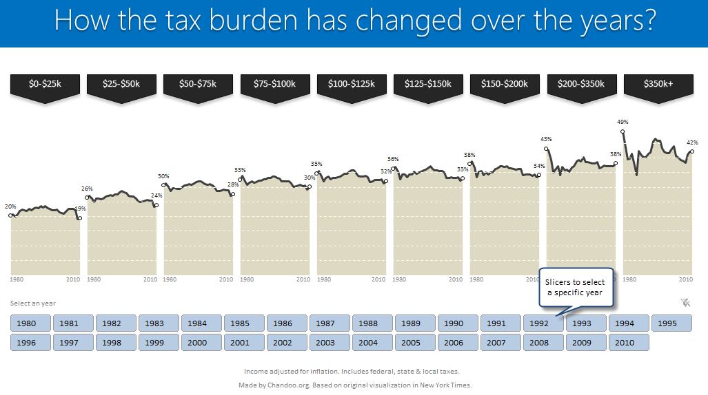
[click here to see larger version]

Recipe for creating this chart using Excel

We need below ingredients to make this chart using Excel
  • Raw data
  • One area chart and few lines on top
  • Simple formulas
  • One Slicer (to select an year)
  • One large cup of coffee or whatever else that you gulp
So if you are ready, lets start cooking.
Step 0: Arrange data
This is a prerequisite for any charting exercise. Although we can work with data in any shape, for quick results, arrange your data in this format:
Data for tax burden chart
In the example file you will find data for overall tax burden for all 9 tax brackets in the years 1980-2010.
Step 1: Create an area chart from all the data
Simple, select tax bracket & tax percentage rows and create an area chart. This is how it should look.
Step 1: Create an area chart from all data - tax burden chart in Excel
Step 2: Insert 2 columns after every tax bracket in your source data
Very simple, just add 2 blank columns after every tax bracket to your source data. This will change your chart to,
Step 2: Insert 2 columns after every tax bracket in your source data - tax burden chart in Excel
Step 3: Adjust data settings so that blank cells are treated as gaps
Right click on the chart, go to Select Data > Hidden & Empty cells
Specify that all blank cells should be treated as gaps. See below.
Step 3.1: Treating blank cells as gaps - tax burden chart in Excel
Now, your chart should look like this:
Step 3.2: area chart with gaps - tax burden chart in Excel
Step 4: Add a line to the chart & format it
Although our chart looks almost like NY Times chart, we still need to show a line on top. For this,
  1. Go to your data, reselect all the tax burden %s and copy them.
  2. Come back to the chart, select it and paste. (more on this)
  3. Excel will add this new data as another series to chart
  4. Right on this new series, choose Change series chart type
  5. Select Line chart
  6. Format the chart so that it looks like below.
step 4: add same data again and convert it in to a line - tax burden chart in Excel
Step 5: Remove grid lines & fake them using additional series
Excel chart’s grid lines always show up behind the data. For our chart, we want them on top. So let just delete grid lines and fake them using additional lines on the chart.
For this,
  1. In your data, add 9 extra rows at bottom (why 9? because we want to show one grid line for every 5% and the maximum we have is around 45%)
  2. Fill first row with 0.05, second with 0.1, third with 0.15… ninth with 0.45
  3. Copy all these and paste them in the chart. You should have nine lines across the chart.
  4. Now, format each line so that it looks like a dull white line with dashes.
  5. When you are done, the final output should look like this:
Step 5: Remove grid lines and fake them using additional series
Step 6: Remove horizontal axis (x-axis) labels & fake them too
Again, horizontal axis labels produced by Excel are useless for us. So we will create our own.
  1. First delete the existing axis.
  2. Then add a text box to the chart and place it where axis should be.
  3. Type the values 1980 few spaces 2010.
  4. Adjust the font size to 7pt.
  5. Now play with the text box until you are satisfied for one tax bracket.
  6. Then copy paste it 8 more times and adjust their positions.
Although we could automate this step, it felt un-necessary as the years are not going to change.

Our chart is almost ready

At this stage, our chart looks like below.
Step 6: remove x-axis labels and fake them using text box with 1980 spaces 2010
It is almost ready, but we need few more additions.
  • We need to add labels to first & last point in each tax bracket.
  • We need a mechanism so that user can select a particular year.
  • When any year is selected, we need to show that year’s tax burden %.

Adding labels for first and last points

This is done by adding one more series of values. This new series (lets call it label-first-last) will have values for only 1980 & 2010. Everything else will be NA().
The formula I used to generate this series is,
=IF(OR(year=1980,year=2010),taxburden,NA())
Once this series is added, we just format it so that only markers are shown (no line) and then add data labels. Format the labels to show in 0% format. Adjust their size and position.
Also add arrow shaped boxes on top to label each tax bracket.

Tax burden chart in Excel - after adding labels for first and last year

Enabling year selection thru Slicers

[This works only for Excel 2010 or above]
In a blank sheet type the years 1980 thru 2010. Select them and create a pivot.
Once the pivot is ready, insert a slicer for the years field.
For detailed steps on slicer creation see this illustration.
Creating years slicer using Excel 2010 - tutorial

Figuring out which year is selected

Once the slicer is ready, we need to figure out if user made a selection thru slicer. To do this,
  1. Use a simple formula to check how many values are shown in the pivot table (ex: COUNTA(pivot!A:A) )
  2. If only one value is shown, then extract it by referring to first row item in pivot (=pivot!A4)

Adding labels for selected year

Once we know which year is selected, we can easily create one more series that has NA() for all values except selected year. The rest you know.

Final outcome – Tax burden over the years chart using Excel

Tax burden over years chart - recreated in Excel

Download this example & Play with it

Click here to download the tax burden chart. Play with it to learn more. Examine the formulas in “Data” sheet & scroll down on “Chart” sheet for step by step instructions.

Do you like this chart?

I really loved how NY Times has been able to tell a very good story by using multiple panel charts. These are great way to examine multidimensional data and understand what is going on.
What about you? Do you like this chart? Please share your thoughts and ideas using comments.

More such charting inspiration

If you are looking for some fresh charting inspiration & ideas, you are at the right place. Check out these examples to get started:

Do you want to create powerful & insightful charts like these?

If you want to learn how to create these types of charts, consider enrolling in our Excel School program. Be warned, you will become unusually awesome in Excel by going thru our course :)
Click here to know more about Excel School.

Wednesday, December 5, 2012

Formula Forensics No. 032 – Creating Dynamic Charts with Non-Contiguous Data

Formula Forensics No. 032 – Creating Dynamic Charts with Non-Contiguous Data:
I have lost count of the number of articles that discuss Excel charts.
There are also quite a few that discuss creation of dynamic charts (where the data to be plotted is determined dynamically).
However, most of the articles assume that the data to be plotted is organized neatly in adjacent cells. But what if you wanted to plot data that is not contiguous?
In this article, we will learn how to plot non-contiguous data. If you can identify an algorithm to locate your relevant data, we should be able to plot it, regardless of where the data is located!


Background Information

The following articles provide good background information on dynamic charts:
Jon Peltier’s article: http://peltiertech.com/Excel/Charts/DynamicCharts.html
Debra Dalgleish’s (Contextures) article: http://www.contextures.com/xlNames02.html
Chandoo’s article on this site: http://chandoo.org/wp/2009/10/15/dynamic-chart-data-series/
This article assumes that you are already familiar with how to create an Excel Name, and how to assign a Name to a dynamic chart. If you need a refresher, please read the above referenced articles.
As with all Formula Forensic posts you can follow along using the sample files: Excel 2007+; Excel 97-2003

Data Setup

For the purposes of illustrating the dynamic chart, I have setup the data as follows:
Column A contains some date values
Column B determines the weekday (Sun, Mon, Tue, etc.) for the dates in Column A
Column C, D, E, F are data values corresponding to the dates in Column A. These will be the four data series that we will plot.
Column G contains text values that will be used as x-axis labels for the chart
A basic chart displaying this data is shown:

Obviously we cannot see which Data is from Monday (Day 1)
To make the chart dynamic, we will plot the four data series only when the weekday value = 1 (denoting Sundays).

(The rows where weekday=1 have been highlighted for ease of reference.)

The formulas that make the chart dynamic

Create the following Names to make references simple:
WeekDayList refers to the range B2:B23
Series1FullList refers to the range C2:C23
Series2FullList refers to the range D2:D23
Series3FullList refers to the range E2:E23
Series4FullList refers to the range F2:F23
LabelsFullList refers to the range G2:G23

If we needed to get the sum of all values in Series1 where WeekDay=1, we would use a formula similar to the following:
=SUMPRODUCT((WeekDayList=1)*Series1FullList)
The argument to the SUMPRODUCT formula resolves to the following array:
={10;0;4;0;0;0;8;0;0;0;0;0;0;5;0;0;0;0;0;3;0;0}
As you can see, there are a lot of zeros for those data points where the WeekDay was not equal to 1.
If we were to plot this array, Excel would faithfully plot the zero values also.

or hiding the Zeroes as:

These charts show the Values but are not ideal.
Some of you might be thinking that you can just substitute zero values with #NA, and Excel will not plot the #NA values.
You are correct. That is one approach to not plotting the zero values.


However, since that is just tricking Excel into ignoring some values (even though the #NA values still exist), we will look at a different approach that truly condenses the array to the non-zero values.

The Technique

First, let us build a helper formula that provides the position of the data where WeekDay=1
SubsetIndex: =SMALL(IF(WeekDayList=1, ROW(WeekDayList)-ROW(INDEX(WeekDayList,1))+1), ROW ($A$1 : INDEX ($A:$A, COUNTIF (WeekDayList, 1))))
Looking at the parts of this formula
ROW(WeekDayList)-ROW(INDEX(WeekDayList,1))+1 creates a sequential array from 1 to the number of rows in WeekDayList:
={1;2;3;4;5;6;7;8;9;10;11;12;13;14;15;16;17;18;19;20;21;22}
IF(WeekDayList=1,…) produces an array with the sequential values above when WeekDay=1, and FALSE otherwise:
={1;FALSE;3;FALSE;FALSE;FALSE;7;FALSE;FALSE;FALSE;FALSE;FALSE;FALSE;14;FALSE;FALSE;FALSE;FALSE;FALSE;20;FALSE;FALSE}
COUNTIF(WeekDayList,1) returns 5 in the above sample data, indicating that we have five rows where WeekDay=1
ROW($A$1:INDEX($A:$A,COUNTIF(WeekDayList,1))) produces a sequential array from 1 to the number of rows where WeekDay=1:
={1;2;3;4;5}
SMALL(…) extracts the 5 smallest values from the IF(…) array:
={1;3;7;14;20}.
Please note that these values indicate the position in the WeekDay list. i.e. the relevant positions are rows 2, 4, 8, 15 and 21 (to account for the headers in row 1).

Now use the SubsetIndex to extract the subset of relevant values in Series1FullList:
=N(OFFSET(Series1FullList,SubsetIndex-1,0,1,1))
We will give it the name Series1SubsetData
Use SubsetIndex-1 because the first row for the OFFSET function is row zero.
The OFFSET function resolves to OFFSET(Series1FullList,{0;2;6;13;19},0,1,1).
i.e. we are asking the OFFSET function to extract the rows indicated by {0;2;6;13;19} in the same column (zero) as Series1FullList, that is 1 row high and 1 column wide.
The OFFSET(…) function returns the array
={10;4;8;5;3}
It would have been straightforward if this returned array was usable as is. However, unless you array-enter this formula over 5 rows, you would not be able to use it anywhere else. (For example, if you check ROWS(OFFSET(…)), you would get the value 1 indicating that Excel is hiding the rest!
That is where the N() function comes in handy.
While the common use for this function is to convert text values into numbers, it also has a hidden talent for converting the references returned by OFFSET into an array.
The N(…) formula returns the following for our data set: {10;4;8;5;3}.
Even though it looks just like the output from OFFSET function alone, it has now become usable for our purposes!
For example, if you use ROWS(N(…)) you will get 5 as expected!

Hint:

Please note that there are other ways to eliminate the zero values from an array. For example, please see the following recent post and responses:
http://chandoo.org/forums/topic/dynamically-generate-contiguous-data-in-array-for-chart-from-non-contiguos-range

We will setup the following Names and formulas for the rest of the data series:
Series2SubsetData =N(OFFSET(Series2FullList,SubsetIndex-1,0,1,1))
Series3SubsetData =N(OFFSET(Series3FullList,SubsetIndex-1,0,1,1))
Series4SubsetData =N(OFFSET(Series4FullList,SubsetIndex-1,0,1,1))

Labels

While the trick with the N() function works with numeric data, it does not work with string data. Since we would like to use the text from LabelsFullList, we will need to use a helper column to extract just the text strings that correspond to the condition WeekDay=1.
There are many ways to extract a text subset, but I have used the following formula in cell J2 and copied down to J23.
=INDEX(LabelsFullList, INDEX(SubsetIndex,ROW(1:1)))

We can ignore the error values since we will only be using the subset that returned text values. We will use the Name HelperColForLabels to refer to cells J2:J23
To refer to just the text values, we will use the following formula, and give it the name XAxisLabels
=INDEX(HelperColForLabels,1):INDEX(HelperColForLabels,ROWS(SubsetIndex))
The above formula resolves to ={“Dynamic”;”labels”;”are”;”really”;”easy”}

Creating the Dynamic Chart

Now that the formulas are in place, all we have to do is reference them in an Excel chart!

For the Chart,
Series1 values refer to =DynamicCharts.xlsx!Series1SubsetData

Series2 values refer to =DynamicCharts.xlsx!Series2SubsetData

Series3 values refer to =DynamicCharts.xlsx!Series3SubsetData

Series4 values refer to =DynamicCharts.xlsx!Series4SubsetData

Horizontal (Category) Axis Labels refer to =DynamicCharts.xlsx!XAxisLabels
The end result looks as follows:

The chart and axis labels adjusts to changes in values in the underlying data, as expected.

Final Thoughts

We have used an innocuous looking function N() to make the chart dynamically adjust to non-contiguous data. (There are other ways to handle dynamic data… but that is for another article!)
Do you know of any other Excel functions with hidden talents?
Please write and let us know in the comments below:
In the meantime, I wish you continued EXCELlence!
Sajan.

Thank You

This was Sajan’s third post at Chandoo.org and so a special thank you again to Sajan for putting pen to paper to describe this great technique here.
If you like this technique, you may want to thank Sajan in the comments below:

Formula Forensics “The Series”

This is the 32nd post in the Formula Forensics series.
You can learn more about how to pull Excel Formulas apart in the following posts: Formula Forensic Series

Formula Forensics Needs Your Help

I need more ideas for future Formula Forensics posts and so I need your help.
If you have a neat formula that you would like to share like above, try putting pen to paper and draft up a Post like Sajan has done above or;
If you have a formula that you would like explained, but don’t want to write a post, send it to Hui or Chandoo.

Monday, December 3, 2012

Become Awesome in Excel while saving money

Become Awesome in Excel while saving money:
Hi Folks,
The moment you are waiting for is here. Our 2012 Holiday SALE is now on.
If you are ready, Just visit Holiday SALE page.
To know more read on…,

What is on sale?

Two of our most popular, awesome & valuable courses are on sale.
  1. Excel School & Dashboards program – Save $30
  2. Excel School, VBA & Dashboards program – Save $50
Our customers from India save Rs 1,200 & Rs 2,000 respectively.

What do you get in these courses?

In Excel School & Dashboards program, you will get
  • Detailed & Step-by-step training on all day to day aspects of Excel
  • Tutorials & examples to make you advanced user in Excel
  • Knowledge on how to use various important formulas, how to combine them
  • How to set up tables, analyze data with pivot tables & do so much more
  • How to create charts, how to add interactive, dynamic features to them
  • Instructions on how to create world-class dashboards, MIS reports
Excel School program has more than 32 hours of video training, 50+ example workbooks & files, 1 year unlimited access so that you can become awesome at a pace that works for you.
In Excel School, VBA & Dashboards program,
  • Everything in Excel School & Dashboards as mentioned above
  • Detailed & Step-by-step training on VB language & macros
  • Thorough understanding of VBA Eco system
  • Dozens of examples on loops, conditions & common coding techniques
  • Overview of SQL, Access & File systems
  • Elaborate examples on user forms, MS Access integration
  • Practical track with every day work problems & solving them with VBA
  • Interesting class projects, homework to test your skills
VBA Classes includes more than 50 hours of video training, 100+ example files, macros & workbooks, 1 year unlimited access so that you can become a rock star in Excel, VBA & Dashboards.

When is the SALE closing?

This holiday sale closes tomorrow mid-night – that is 4th December, 2012 mid night – Pacific Time.

Hurry up and Enjoy the sale

Go ahead and enroll in one of these courses. Become awesome in Excel.
Click here for the holiday sale page.
PS: This year alone, more than 1,000 people have enrolled in above 2 courses. You too can unlock the power of Excel & make difference in your work. Go ahead and join us.

Sunday, December 2, 2012

Chandoo.org Holiday SALE, Starts on Monday – 3rd December!

Chandoo.org Holiday SALE, Starts on Monday – 3rd December!:
Here is a quick announcement folks!
Many of you asked me whether we are going to have a holiday sale at Chandoo.org this year. Of course we have a sale!


Chandoo.org Holiday Sale, Starts on Monday - 3rd December!

Details of Chandoo.org Holiday Sale – 2012

Dates of the sale – 3rd & 4th December, 2012 (Monday, Tuesday)

What is on sale?

This year, you can save up to $50 on our best selling training courses.
With both of these courses, you get full downloads, 1 year access to all material & excellent support. More than 2000 professionals from all over the world have gone thru these 2 courses & became awesome in Excel. Now its your turn.
Remember: the sale opens on 3rd December 6AM and closes well after midnight on 4th December (Pacific Time)

What a bummer, I just paid full fees:

Do not worry. We take excellent care of our existing students. For all of you who joining either of these programs in last 3 weeks, I am going to send a special bonus (valued $50) to compensate. Why? because we are awesome like that!
That is all for now. See you next week.

Macros for Automatically Implementing Modeling Best Practices

Macros for Automatically Implementing Modeling Best Practices:
This article is written by Myles Arnott from Excel Audit
In the first part on our Modeling Best Practices series, we learned 5 best practices to follow. This article shows how to automatically implement the best practices using macros.
Best Practice Modeling using Excel - Make these 5 changes to your Excel models today

Quick Re-cap on Modeling Best Practices

Make cell content and cell purpose visually identifiable at all times
In the first article I highlighted the fact that the content and purpose of every cell should be easily identifiable to the user at all times.
At a basic level we can identify two basic cell types:

Type Background Font Protection
Assumption or constant White Blue No
Output Grey Black Yes

Best Practice formatting made easy

In order to make the application of Best Practice formatting quicker and easier I have created three simple macros. These macros use Excel’s Go To Special function and then some simple formatting to the active sheet.

Demo of the macros

Please watch this 5 minute demo to understand how the macros work.
[Click here to watch the video]

Overview of best practice macros

Auto_Format:  automatically formats cells depending on their type:
  • Number constants (i.e. input cells) are white background, blue font & unprotected
  • Non number constants (e.g. formulae) are grey background, black text & protected
Constants_Format:  formats selected cells as white background, blue text & unprotected
Formula_Format: formats selected cells as grey background, black text & protected

And a couple of extras:

Simple_Audit:  A Simple Audit Macro that uses the go to special function to select and highlight specific cell types. This is the macro from the Managing Spreadsheet Risk article.
Clear_format: formats all cells as white background, black text & protected
A word of warning: These macros apply formatting to your spreadsheets. This formatting cannot be undone.

File to download

Since formatting steps vary for Excel 2003 & 2007, we have 2 versions of the files. Please download the appropriate file below:
Excel 2007 and above version
Excel 2003 & below version
These files have the macros embedded in them. You will need to move these macros into your personal workbook. Help on this.
Once in your personal workbook you can then add these to your QAT, or Ribbon.

Conclusion

Have a play with the macros on the example workbook and then, once you are happy with how to use them, you can start applying best practice formatting at the click of a button.
Let us know how you are implementing these best practices and your suggestions using comments.

Thanks to Myles

Many thanks to Myles for compiling all the tips & sharing this with us. If you have enjoyed this article, please say thanks to Myles. You can also reach him at Excel Audit or his linkedin profile.